UI/UX Trends To Watch Out For in 2025
April 10th 2025
The digital design market has also seen a massive upsurge and technological growth. The year 2025 is quickly approaching, and the boundaries of modern technology are consistently expanding and providing the direction of better user experience and interface. The human urge to explore new methods to do things quicker and creatively leads to digital innovation transforming practically every business and area. Web developers and designers are responsible for discovering and testing new design types and improving the experience of countless users worldwide. We can witness developments in fields like colour theory and universal design that indirectly impact the expectations of the user of our products and services. The UX and UI of a digital product, such as a website or app, may significantly impact a user's first impression of your brand or organisation, so hiring the best creative agency is better. Thus, it's crucial to adhere to best practices. Designers are looking to architect user experience, not around the product but the users themselves, because building digital products has never been enough. If you want your brand to keep in check with all the designs and marketing strategies, then you can hire UI/UX design agency in India that offers multiple services and assists you in making your brand stand out from the crowd. But it can be difficult for creative agencies to be aware of all the ongoing or upcoming UI/UX trends. Still, we have done a lot of leg work for you and listed the most prominent trends in one place, have a look:
Gradients
The gradual blending from one colour to another is known as gradients. Following the process, the designer can create a new colour according to their requirements and clients' preferences. In simple terms, gradients add depth. It makes objects stand out by adding a new dimension to the design and adding realism to the thing.
On the other hand, a gradual blending from colour to white or black can minimise the distance to a light source. Real life isn't made of flat colours, which means gradients are more faithful to the real world because, as mentioned, gradients are returning.
We're seeing them increasingly in branding, illustration, typography and UI. Gradients make more colours available because they create more colour tones. Gradients are eye-catching and memorable because they're colourful and playful and make for visuals we're not used to seeing.
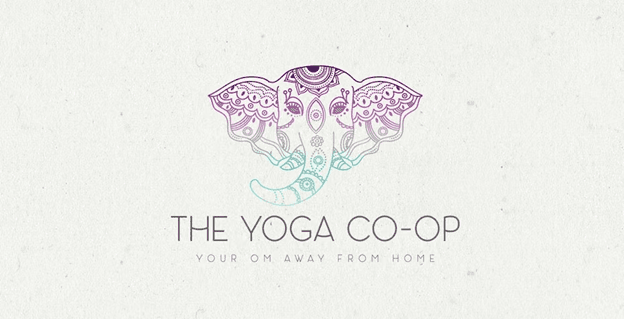
In contrast, gradients can also serve a completely different purpose regarding wellness branding. A gradient feels relaxing in cool colours (like in The Yoga Co-Op logo, for example). Cool-coloured gradients often feel like the perfect choice when building an identity for a relaxation-based wellness brand, like a salon or a spa.
Brutalism
It is derived from an architectural style that was very popular from the 1950s until the 1980s. It is clear why this web design style is named after the architectural style that translates to 'raw or unfinished concrete.' Such designs evoke the same emotions very much that a brutalist building can. Secondly, the strangely unique appearance of these websites can also be attributed to reactionary attitudes among younger people. There is the constant rediscovery of the use of gradients, colours with solid contrast, borders, and allusions to traditional drawings and pictures with photorealistic photography by web designers.
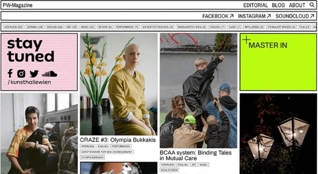
If you want to know how striking a brutalist magazine can be, then PW-Magazine is the perfect example. The Arresting preview images dominate the site. You can see the interface is presented in a well-thought-out direction. One can rely on common web design principles to create a user-friendly brutalist website.
Maximalism
Every design does not work out for every website out there. Additionally, as minimalism is quite popular in various UI/UX creative agencies, adopting a maximalist mindset can serve the purpose of brand differentiation and identity. Maximalism can be defined as an aesthetic of excess-maximalist practitioners' method that helps to effectively portray individualism through utilising bold colours, patterns, textures and visuals to cover up any blank space. The core idea behind a maximalist approach is to grab the audience's attention and hold onto it by using different visual elements to help tell a story.
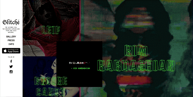
You can see Glitché, which lets you edit photos and videos using over 50 effects, and to that effect, has a mesmerisingly maximalist website.
We'll be honest. This site is not for the faint of the eye. A neon-green loading screen greets you before giving way to a series of pages layered with videos and images.
The maximalist design grabs your attention in merely a glance and scroll, offering you an unforgettable experience.
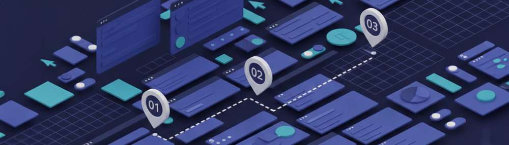
3D Imaging
Many websites and applications now include pictures enhanced to be colourful and active, poor artwork, or 3D objects to beautify or supplement the content. Nowadays, 3D images are being used more in social media posts. These 3D images spruce up the information on many websites and apps since the latter is inextricably related to the proliferation of virtual and augmented reality. The best creative agency makes the best out of each trend, and 3D imaging allows one to have access to creative freedom to design something more communicative and attractive.
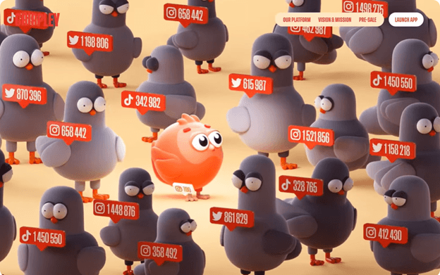
Chirpley connects brands with micro-influencers through its AI-powered marketplace. They offer a non-traditional way of marketing, and this company website breaks free from conventionality with a design full of three-dimensional cartoon visuals.
A red bird appears throughout this website. This quirky feathered mascot is at the centre of its brand identity, and its appearance balances the more technical information explaining how its product works.
Well-being/Healthiness
The pandemic period makes people realise the need for mental health and the normalisation of working from home, which leads to awareness of living a mentally flourished lifestyle. So this awareness of putting yourself first leads to a great demand for mental state-friendly designs and experiences. This pattern of behaviour will be reflected in the emergence of other related trends within the Design Industry. This resulted in the rise of wearable gear for monitoring mental and physical health and the introduction of more subdued "calming" colour palettes for electronic displays.
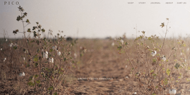
The Pico brand follows the motive of being eco-conscious. The calm palette of their website promotes that organic feel. Light beige, green, and brown are usually associated with nature and health. The colour choice communicates their mission very well.
Scrolly telling
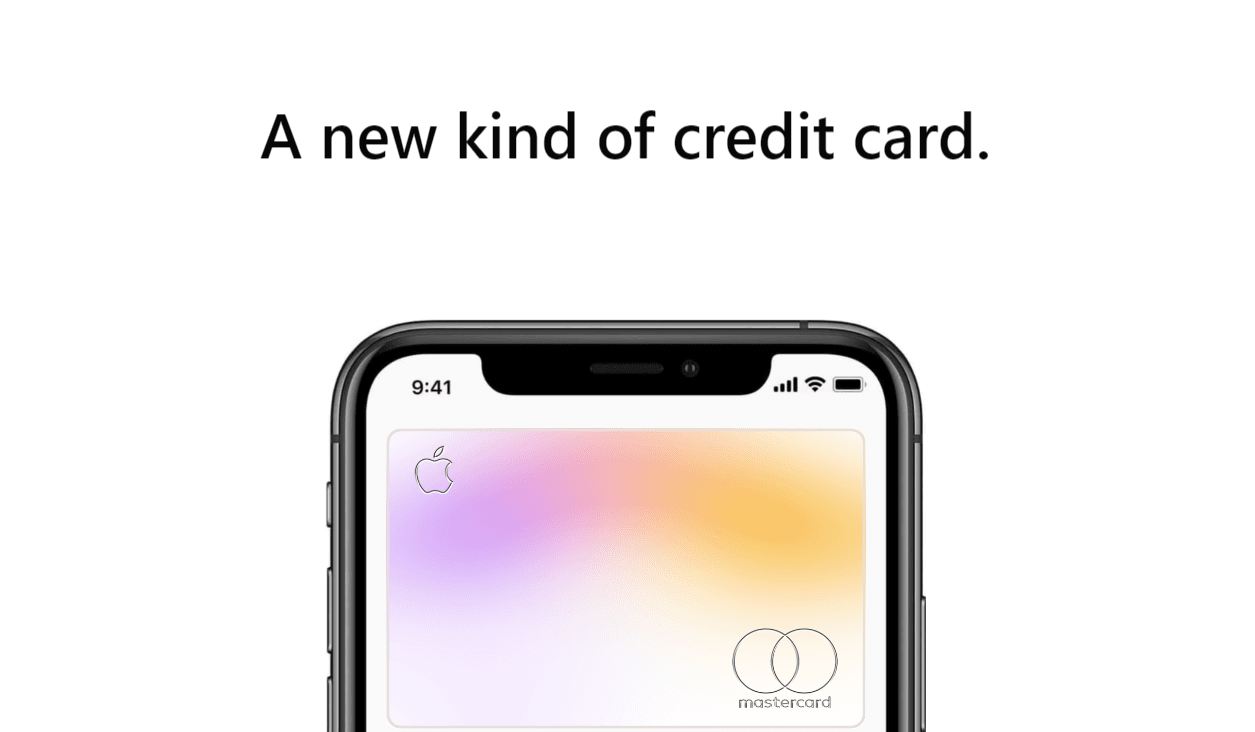
Nobody wants to scroll down for relevant information, hoping that boring sections of the page will finally turn into something useful. Scrollytelling is a recipe for that. It's a set of tricks that energise users and make them see a page in a new light. For example, you scroll and see many animations next to the text in the centre. Or an additional graphic explaining what you just read. Scrollytelling is about providing further context, providing other explainers, and enriching content with dynamic elements that lure users through movement, colour, and contextualisation. You can witness the scorllytelling in this apple card scroll animation.
 https://webflow.com/made-in-webflow/website/applecard
Modifying traditional cursor
A cursor is known as the unsung hero of every website, which moves silently but can create an impactful impression. It is the most prominent way a user interacts with the UI because the cursor usage is universal. So the custom cursors can be seen grabbing users' attention since 2021, but in the approaching time, the rise in google chrome extensions helps create a brand identity. You can hire a UI/UX design agency and then ask designers to incorporate their creative ideas to modify these cursors.
We see, for example, Duolingo, Tiktok and Discord offering custom cursors for loyal fans.
Sweet life
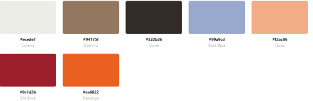
Eye candy colour schemes are filled with popping and bright colours that can easily hold the user's attention but are not frustrating or intimidating. As the name suggests, it resonates with sweets, lollies, candy apple pies and jelly beans, so now designers have to play their role in making the best combination of sweet colours that need to be balanced in a sophisticated way to make your interface look more professional.
Here you can see how these lovely colours make their comeback.
Glassmorphism, Pearlcore & Iridescent
As the name implies, glassmorphism is a style that uses glass's properties in the designs. If you want to make your design elements look transparent and translucent, then you pick glassmorphism. These shapes and elements enhance the visual hierarchy and work well on vibrant, colourful backgrounds, accentuating the glass effect. With the assistance of this effect, you can easily highlight the content you want to present to your users.
Micro-animations
If you want your user to experience the interface smoothly and provide a right-away response to their action, then add micro-animations to your website. The experience of content swipe can be elevated through micro-animations, as it magically turns a simple gesture movement into a unique interface retaining a user more on a website. You can check the home page of MA True Cannabis which consists of various micro-animations. You’ll notice that, on hover, each of these elements becomes animated differently, and a fun message encircles them.
 https://ch.maswitzerland.com/
Virtual and Augmented Reality
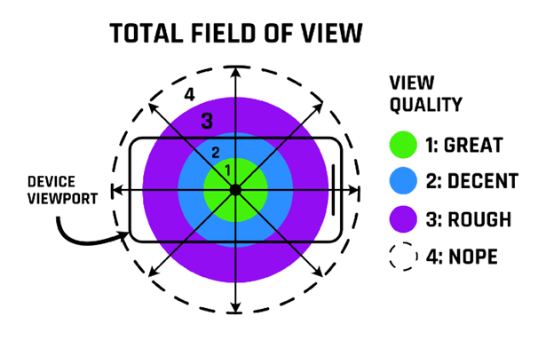
Augmented reality is made up of effects, user interfaces, and modified manipulated to make users experience the augmented reality of their normal existence. While in VR, the fact is replaced by the virtual environment. So while incorporating these effects in UI/UX, the experience will be different from usual as it will offer surface-less interactions, which means no touch screen at your disposal. Most interactions will be the sum of diverse nature, not gestural, followed by eye movement, thumb controls, reach-depth, speech recognition, head-tilt gestures, and much more. The following image is the total field of view that a user has, and it will be a challenge for the designer to fit the design reasonably within their comfortable cone of standard vision.
Dark Mode
Nowadays, users are looking for a soothing, less overwhelming visual experience. Dark UI/UX design trends are less saturated and more minimalist, offering multiple user benefits, like increasing engagement, improving focus, and decreasing the time it takes. It makes your website more functional and usable. Still, it is the designer's responsibility to provide enough contrast in the design to make all buttons and functionalities easily accessible and visible.
You can check out this interface to understand better what dark UI/UX looks like.
Mobile-first design
The usability of a web design can only be justified when it serves the purpose of coordinating with the mobile design to ensure a flawless experience of using everything on any device. This indirectly defines every other trend because people use mobile phones in every possible way and everywhere for many reasons. It can be anything from talking to friends online to booking flights, online window shopping or attending video calls, So everything should be handled in one go, and design language should get adopted on every single device As you can see, design trends are human-centric and serve the purpose of human satisfaction proficiently. There is a reason behind this approach as companies are not designing these products for themselves but for the people who are conscious about what they need and desire. Suppose you are looking to hire UI/UX design agency in India. In that case, Designbox is the right place to rely on them as we try to incorporate all the trendy designs created to represent your brand with its authentic essence.