Elements of Visual Communication
January 30th 2019
Colours, textures, lines, dots, shapes, patterns – just look around you, visuals are everywhere! Images and visuals are the essence of the world we live in, they surround us and we are constantly consuming thousands of visuals every day. Some good, some bad, and some extraordinary. But what really makes a visual shine through the millions we are bombarded with daily? And what is it that makes visual communication the go-to communication tool for brands and companies? In recent times, the aesthetic and visual style associated with a brand gives them an appeal and customer base like no other. Humans are adept at processing visual information, we are drawn to the beauty and visual communication is the perfect way to harness that to give your brand an automatic edge. It defines the brand’s identity, communicates messages in a clear, engaging manner, generates instant attraction and eventually leads to more sales and a loyal customer base! Here are some elements that together create a successful visual communication design:
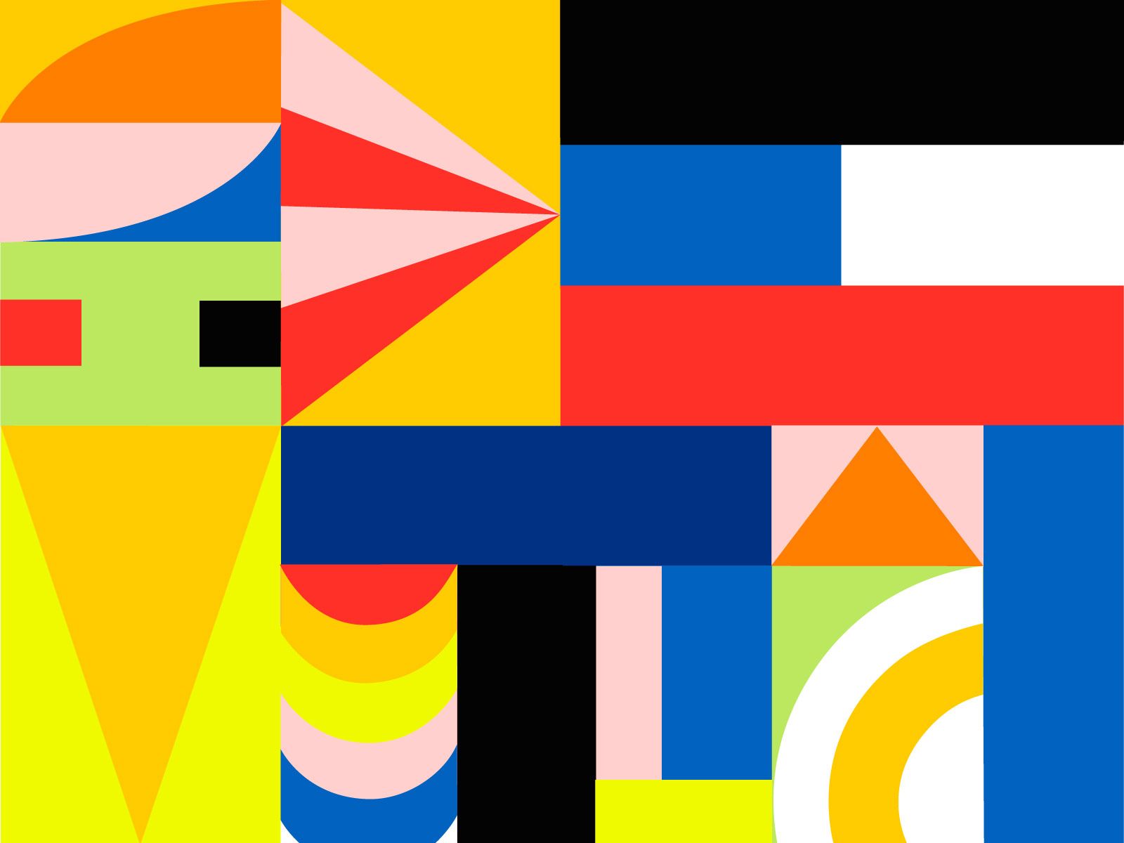
Points and Lines
The most rudimentary, basic elements that are the core of every image. Points and lines might seem like the simplest, most basic building blocks but they have endless potential. Points can guide a viewer’s gaze, they can immediately capture attention, and they can cumulate to create something much greater like patterns, designs, shapes, and forms. Similarly, even lines are capable of conveying complex information just through line width, composition, overlaps, shadows, empty spaces, etc. The simplest visuals can convey hierarchy, information, emphasis, and meaning as well as give a unique flavour to your designs.
Shape and Form
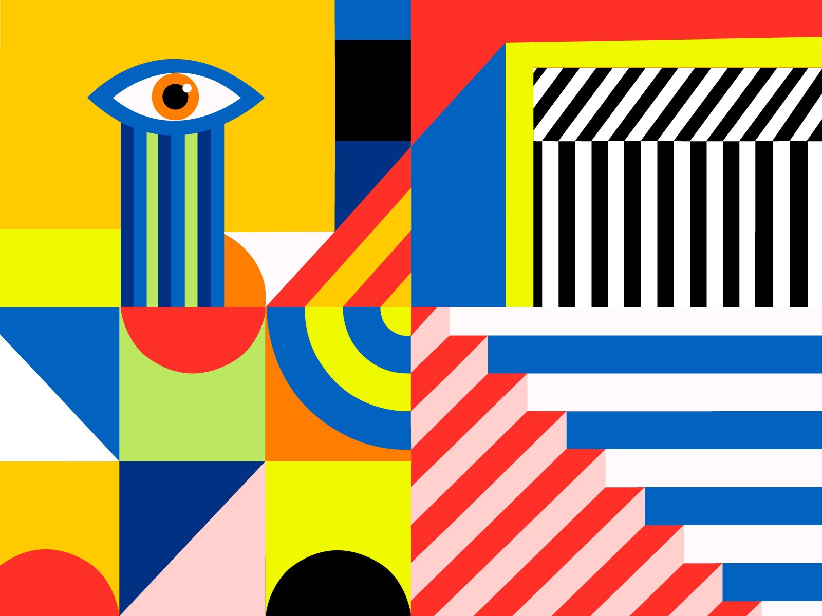
You’d think shapes are simple, but when used correctly, shapes and forms can change the entire style of the design. From geometric to natural, from flowing to angular, from dominant to subtle – shapes alone can build a visual identity. Their 3d version, forms, have even more power. And combined with texture, colour, and placement shape and form add a creative, visual element to any communication to make it eye-catching and easily understandable.
Colour
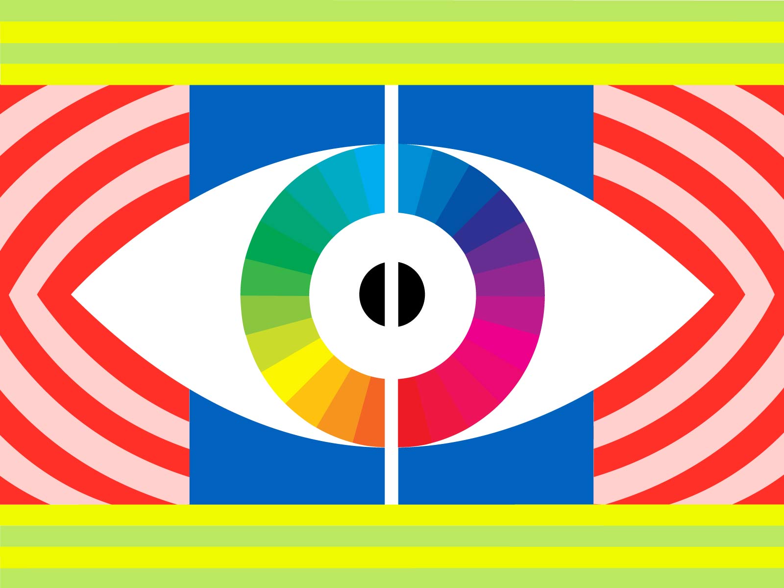
When you think of visuals, colour is the first thing that pops into your head. A single colour has the power to change the mood, energy, and emotion of an image. It can evoke feelings of happiness, sadness, excitement, and even hunger! Colours are a powerful tool for designers since each colour communicates so much meaning. It creates an instantly recognisable brand identity – think about it, it’s hard to think of McDonald’s without that famous golden M thus brands must curate their identity and aesthetics very carefully. Customers immediately associate a visual aesthetics and qualities with these colours – this is why financial institutions use colours such as blue to establish a reputation of trust, reliability, and calmness.
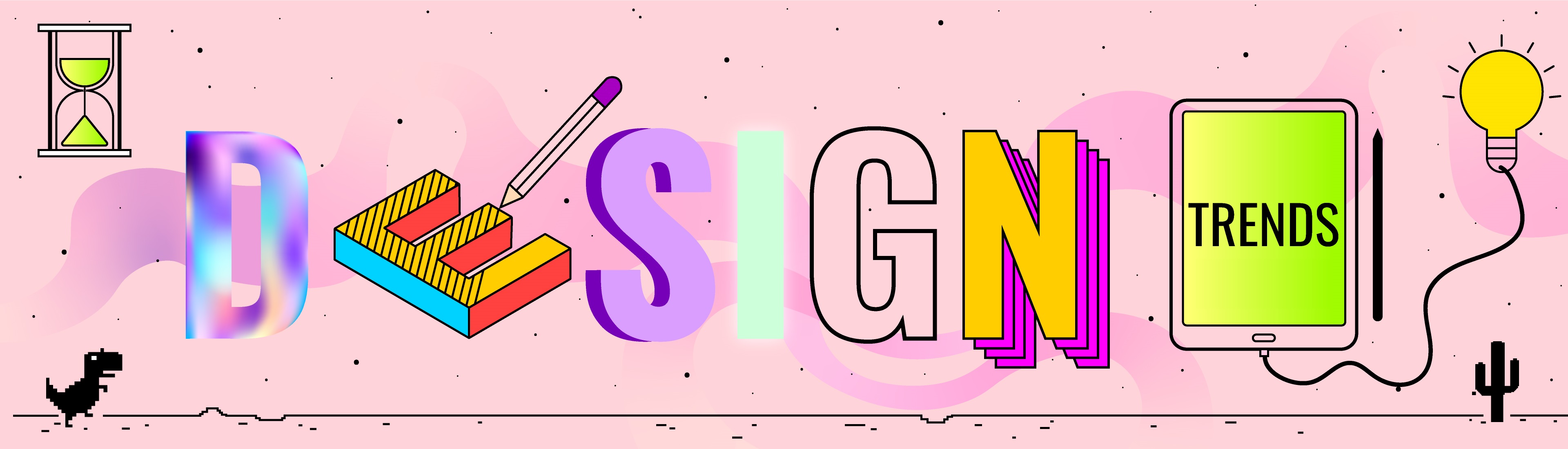
Typography
The type of fonts we use, leave an imprint on the mind of the readers. One can’t use Comic Sans in order to be taken seriously. The typography should be used effectively as it may elicit an emotional response and will contribute heavily to the visual mood. It should be used in coordination with the images, colours, videos and other elements as it defines the tone of the content and eventually fonts begin to be associated with the brand and its aesthetic.
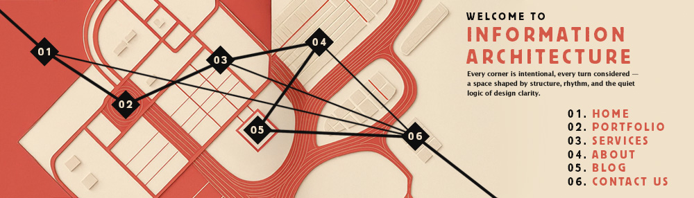
Layout
While layouts may seem like a more subtle aspect of design, the placement of elements is what creates meaning through hierarchy, emphasis, and sizing. The overall representation of a design, through efficient and thoughtful positioning and sequence of text and images, is what plays a vital role in reinforcing the brand’s style and image. This is especially important in case of publication design, advertisements, and other communication to create a clear, concise, influential message for the audience.
Texture
Texture, when simply defined, can be referred to the feeling you get when you touch the surface of a substance. But how do we bring that feel virtually? This calls for defining different types of textures.
- Tactile: Tactile texture have 3-D characteristics that you need to touch, in order to appreciate or feel it. For example, a fuzzy chair cover is an example of a tactile as you need to actually touch to realise its texture.
- Visual: Visual texture is the design created virtually so that the viewer gets the same expression of touch, visually. You might have come across many paintings which look real enough. The combination of shadows and bright spots create an illusion of reality in the viewer’s mind, making the content a lot more interesting.
Space
Space is another important element of visual communication as well. Usage of space affects the viewer’s perspective too. Space is further defined as Negative and Positive space. While the positive space is the space covered by the main subject to be emphasised upon, negative space refers to the leftover or unused space in an image or illustration. Too much of negative space makes the illustration look dull but on the other hand, excess of positive space makes the illustration flashy. Hence, the smart composition of space is necessary to keep the hold of viewers. All these elements are part of a larger recipe for successful visual communication. Visual communication is powerful and if used correctly is a fool-proof method to generate interest in viewers and eventually establish a suitable image for the brand which can create a loyal customer base, increased sales, and a long-lasting impact on the target audience.