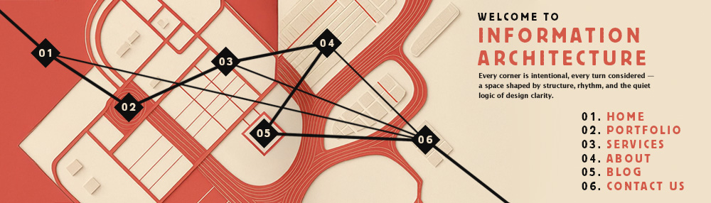
The Importance of Text Layout
September 18th 2025
When we think about design, the first thing that comes to mind is usually visuals such as colors, images, or graphics. But design is not the only factor that entices a viewer to stay engaged. One of the most crucial yet underrated elements that determines how long someone interacts with a piece of content is text layout. From ancient manuscripts meticulously arranged by scribes to modern websites and digital interfaces, the way text is structured influences readability, comprehension, and even credibility. Attractive visuals can grab attention for a moment, but poorly arranged text will quickly drive people away. A thoughtful layout not only conveys information effectively but also enhances the overall design experience.
Text Layout: Lessons from History
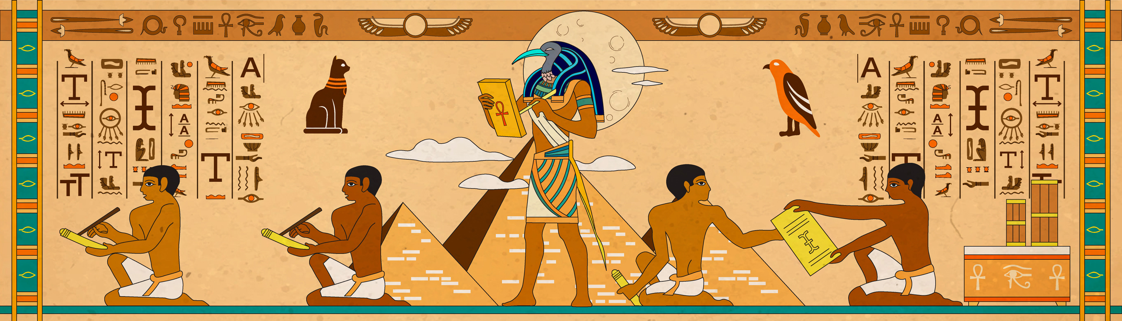
The importance of text layout is not new. In the medieval era, scribes devoted painstaking effort to the layout of manuscripts. Using precise techniques such as pricking and ruling, they framed text blocks with care to ensure neatness and clarity. Manuscript pages often featured generous margins, sometimes taking up nearly half the page, which supported legibility and helped preserve the text. Even in early scriptures, icons and symbols were strategically placed alongside text to effectively communicate ideas. Icons have long served to communicate ideas visually, and today, visual cues have taken the form of bullet points, section dividers, and UI icons, helping readers quickly identify and process key information. The principle remains the same: how text is presented directly impacts how it is understood.
Why Text Layout Matters Today
In today’s digital-first world, text layout has taken on even greater importance. From graphic design to publishing, web design, and user experience design, layout shapes how users perceive and interact with information. Think about opening a webpage. If the content is a dense wall of text with no hierarchy, most users will skim or leave. On the other hand, a page with a clear title, well-structured subheadings, clean paragraph spacing, and highlighted pointers invites the reader to stay longer. Design grabs attention, but layout sustains it.
The Pitfalls of Poor Text Design
Poorly executed text layouts are one of the most common reasons people abandon content. The human eye naturally seeks patterns and structure when reading. Without it, reading becomes tiring, confusing, and disengaging. Common issues include poor typography that uses fonts that are hard to read, inaccurate text dimensions, such as oversized headings or tiny body text, and poor placement that ignores margins, spacing, or alignment. These mistakes increase cognitive load and make reading feel like work instead of a smooth experience.
Legibility and Readability
When discussing text layout, two concepts often arise: legibility and readability. Legibility refers to how easily individual characters can be distinguished. Font choice, weight, and spacing affect this. For example, a thin, light-colored font on a bright background may look stylish but can be difficult to read for long passages. Readability refers to how easily the text as a whole can be understood. Line spacing, paragraph length, and even the copy itself contribute to this. By prioritizing both, creators can develop layouts that engage users while conveying information clearly.
The Interplay of Design and Content
Design and content are inseparable. A remarkable design might capture attention, but if readers do not engage with the content, the design has failed in its purpose. Conversely, strong content can be overshadowed by poor layout and typography. They are complementary forces. Good design enhances content, and good content justifies design. Practical techniques such as thoughtful typography choices, strategic use of white space, balanced alignment, and harmonious text arrangements ensure that both content and design work together. When they align, the result is not just a functional page but an engaging and memorable experience.
The Power of Simplicity
Simplicity is often underrated. A well-organized text layout does not need to be overly complex to be effective. Even small changes, like increasing line spacing or reformatting paragraphs, can dramatically improve readability. For example, investing just a few extra minutes in reworking a blog post or presentation can turn an ordinary piece into something that resonates with readers. Simplicity reduces cognitive load, eases navigation, and improves usability. The most effective layouts often follow basic design standards such as consistent typography, clear hierarchy, and thoughtful use of color. These principles may seem simple, but they are the backbone of engaging text design.
Consistency Is Key
One of the hallmarks of professional design is consistency. Just as brands maintain a visual identity with colors and logos, text layout must remain consistent across all platforms. This includes font choices that are limited and complementary, styles that maintain consistent heading sizes, bullet formatting, and paragraph spacing, and color palettes that align with brand identity while enhancing readability. A consistent approach not only reinforces professionalism but also builds trust with the audience.
Everyday Examples of Layout in Action
- The significance of text layout is visible in every medium we interact with.
- In websites, clear menus, headings, and section breaks help users navigate content quickly.
- In magazines and books, columns, drop caps, and justified alignment create a polished reading experience.
- In presentations, well-structured bullet points and consistent formatting keep audiences focused on key ideas.
- In user interfaces, buttons, labels, and instructions must be arranged for quick comprehension.
Even in this article, the title uses a larger font size, subheadings break down sections, and pointers highlight essential examples. These are all examples of layout in action.
Conclusion: Layout as the Silent Communicator
While design often takes the spotlight, it is text layout that quietly shapes the user’s experience. From ancient manuscripts to modern websites, layout has always been the foundation of effective communication. A well-structured layout enhances readability, engages the audience, and complements design. It reduces strain, builds trust, and ensures that both visuals and content work in harmony. Design may catch the eye, but it is thoughtful text layout that captures the mind and keeps the reader coming back.